BANKING UI
I have designed a banking interface for mobile and web that provides a way to monitor and manage finances. It combines the robust account management of a banking application, with analytics features that you need, to track your spending.
Role -
User research, visual and interaction design - self-directed project
THE PROBLEM -
EVEN though there are multiple banking apps, people shy away from using them
Almost every bank has a banking website as well as a mobile application. But very few people use those applications efficiently.
Not sure how to use it
According to a google study, When asked users what they found most valuable in their favorite finance apps, 64% of them reported ease of use and navigation. If an application is complex to use or if accomplishing the basic tasks take a lot of time, people may skip using the banking applications.
don't see the benefits
Applications may lack the lack of functionality that people need to use. I conducted competitive analysis and qualitative research to understand what people looked for in online banking
GOAL -
I narrowed down my goal to identifying the key tasks and making them more discoverable, efficient and easy to use.
USER RESEARCh -
For understanding the expectations and frustrations of the digital banking experience, I used Slideshare, Twitter, Reddit. I then performed competitive research of the popular banking and monitoring applications. After looking at the applications and the features they provided, I interviewed 8 users to understand their needs and pain points.
COMPETITIVE ANALYSIS for banking and management applications -
Since the banking and finance space is a crowded one, I conducted Competitive research on some of the topmost relevant competetors.
Lack of Usability for basic tasks
Although most of the people found that the the baking apps were very convenient. Navigating through these applications and performing basic tasks were still cumbersome. A reviewer told that he was finding the payment of his bills for credit card very difficult through his mobile application, but this option was quite clear through web.
Very few banking applications show analytics
After conducting competitive analytics, I found that very few applications provided the capabilities to monitor or analyze their finances. Only a few applications like Mint provided analytics on spending, budgeting etc. But there is no option to manage the accounts through these. One reviewer was using excel sheets to check his spending.
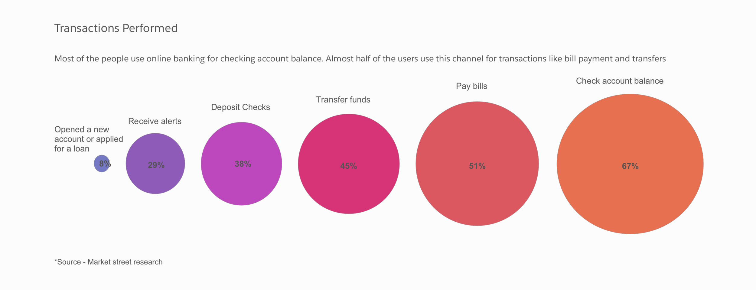
61% of U.S. adults don't even have a budget
According to Business Insider, 61% of the population doesn't keep track of their spending and don't maintain a budget. Integrating a dashboard which shows analytics and budget in the application, would enable people to see and keep track of the spending requirements.
FEAtures -
Based on the above research, the tasks that people would like to accomplish through any banking application, can be categorized into -
Monitor -
Includes checking the balance, analyzing the spending etc. With the analytics dashboard, users can monitor their budget as well as track spendings.
Manage -
Includes tasks like Transfer balance from one account to another, pay bills, deposit checks etc. Using this users can control their finances.
So, the features that I focused on in my application were centered around Monitoring and Management of finances.
SKETCHES -
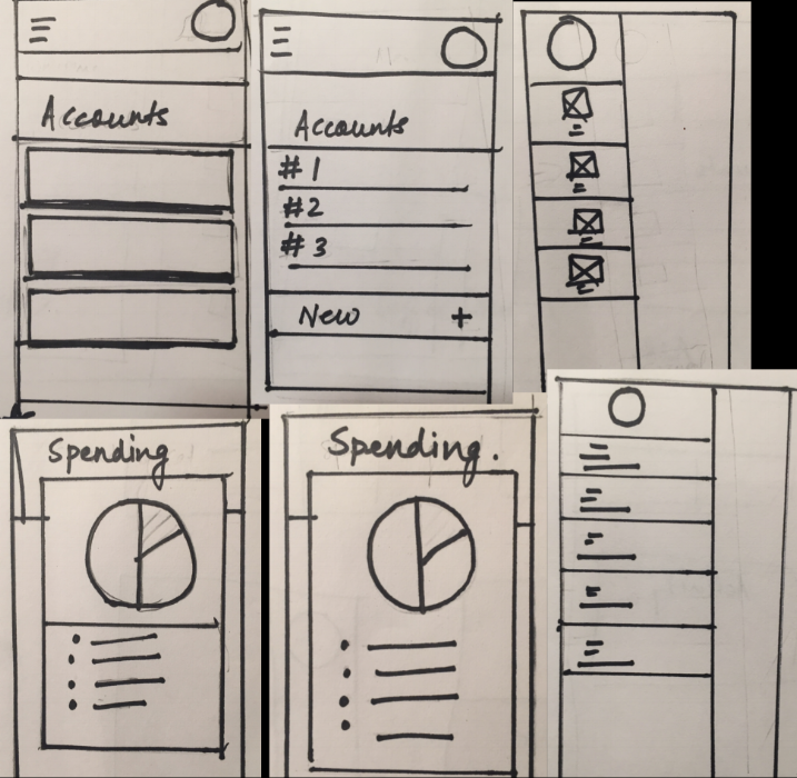
Mobile -
Since most of the people use mobile applications for basic transactions, I wanted to make the UI very uncluttered and wanted to make the user focus on one thing at a time.
My main focus was making the basic tasks like
- Viewing account balance
- Transfers/deposits
- Spending categories
seem very natural and easy for the user.
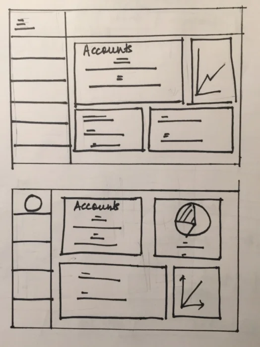
Web -
Since more real estate is available for web interfaces, I wanted to use cards for displaying -
- Account balance
- Account summary
- Expenditure
This would enable the user to view his bank summary in one go, without wasting time in clicking and searching for these tabs.
Usability testing -
Performed usability testing on Hi-fi & low-fi prototypes.
Some of the tasks I focused on were -
- Make balance transfer between your accounts
- Send money to someone
- Check your monthly budget
Based on the user behavior, the metrics I used were -
- Easy navigation - Whether the users were able to quickly find and choose the desired menu items
- Path deviation - The value in this method is that not only do you observe tasks that the user fails, you can also observe difficulties users face even in tasks they complete successfully
- Proper visualizations - Whether the chart visualizations were able to convey correct and desired information to the user
Learnings from Usability studies-
Top Concerns -
- For the tasks involving transfers and payments, some users were confused as to which option to choose
- Adding a new payee was difficult to discover while making payments
Top Insights -
- Once past the initial learning issues, participants were generally able to quickly choose the correct navigation options
- Options like showing monthly budget and monitoring per category offered a high utility
designs -
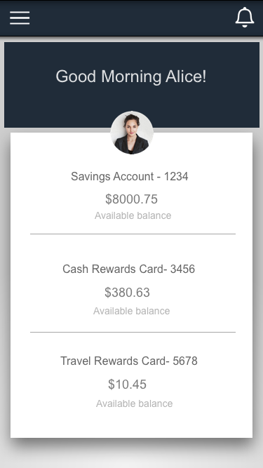
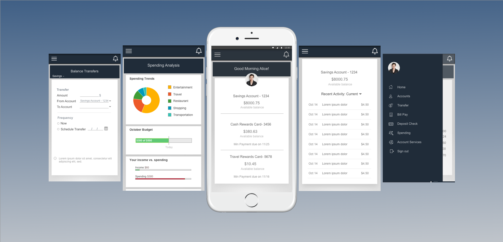
Mobile -
Account summary
- This would enable the user to view his/her bank balance/ credit card balance in one go.
Other activities -
On clicking the menu icon on top left, user can view/complete basic tasks like
- Account Activity
- Transfers
- Deposits
- Spending Categories
- Account Services
- Help & Support
Spending Categories -
Some of the users would like to see their expenditure in easy to understand charts and graphs.
This would enable them to categorize how much amount they spent in different categories like restaurants, travel etc.
WEB -
Account Activity -
After coming to this tab, user would get a detailed information on his
- Account balance
- Payments
- Detailed account activity
Spending Categories -
Some of the users, wanted to analyze their spending. Some of them said that they still used Excel sheets for keeping track of and analyzing their expenditures
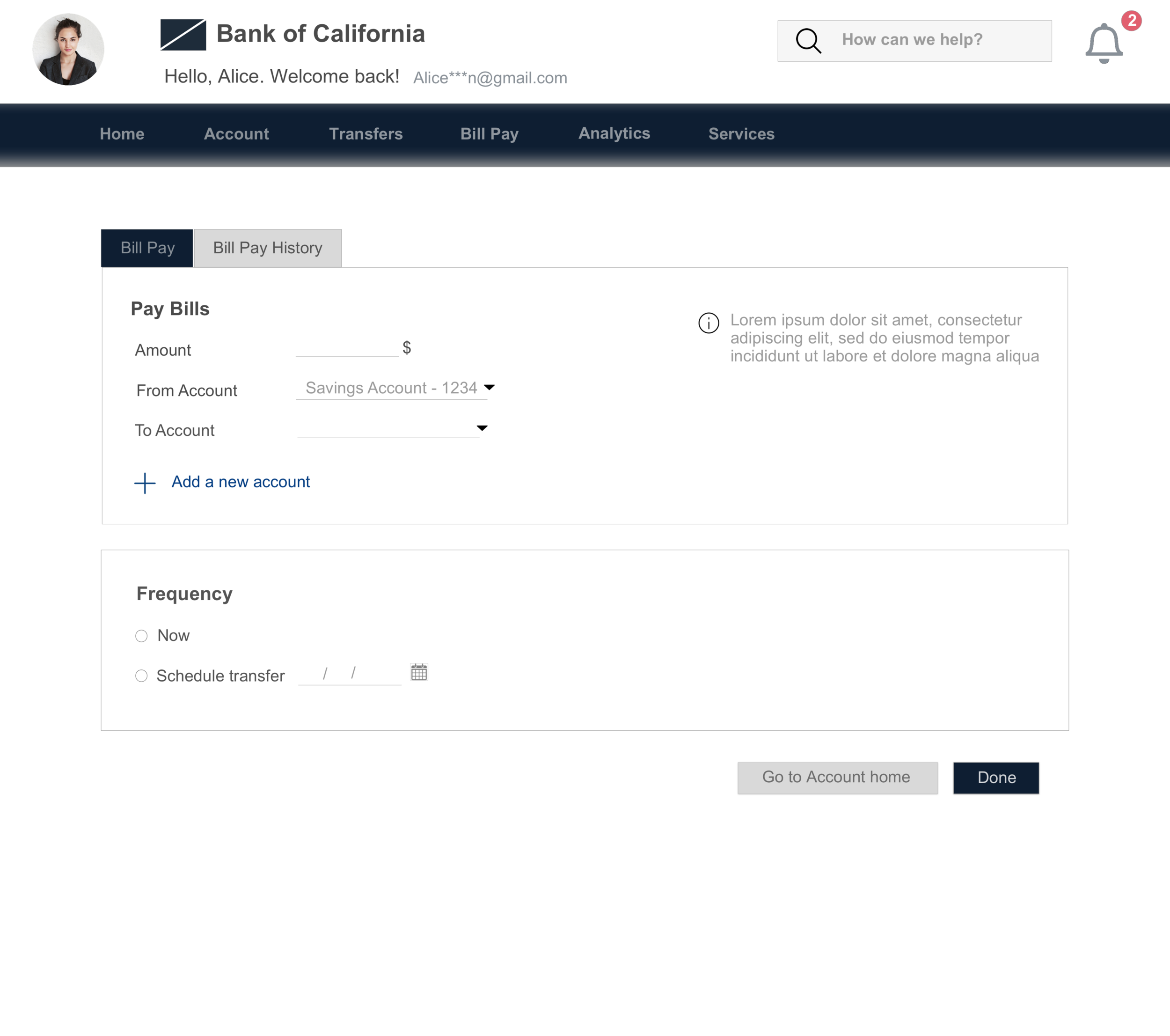
Payments -
I wanted to make a clean flow for making payments, since this is one of the most performed tasks by the users.
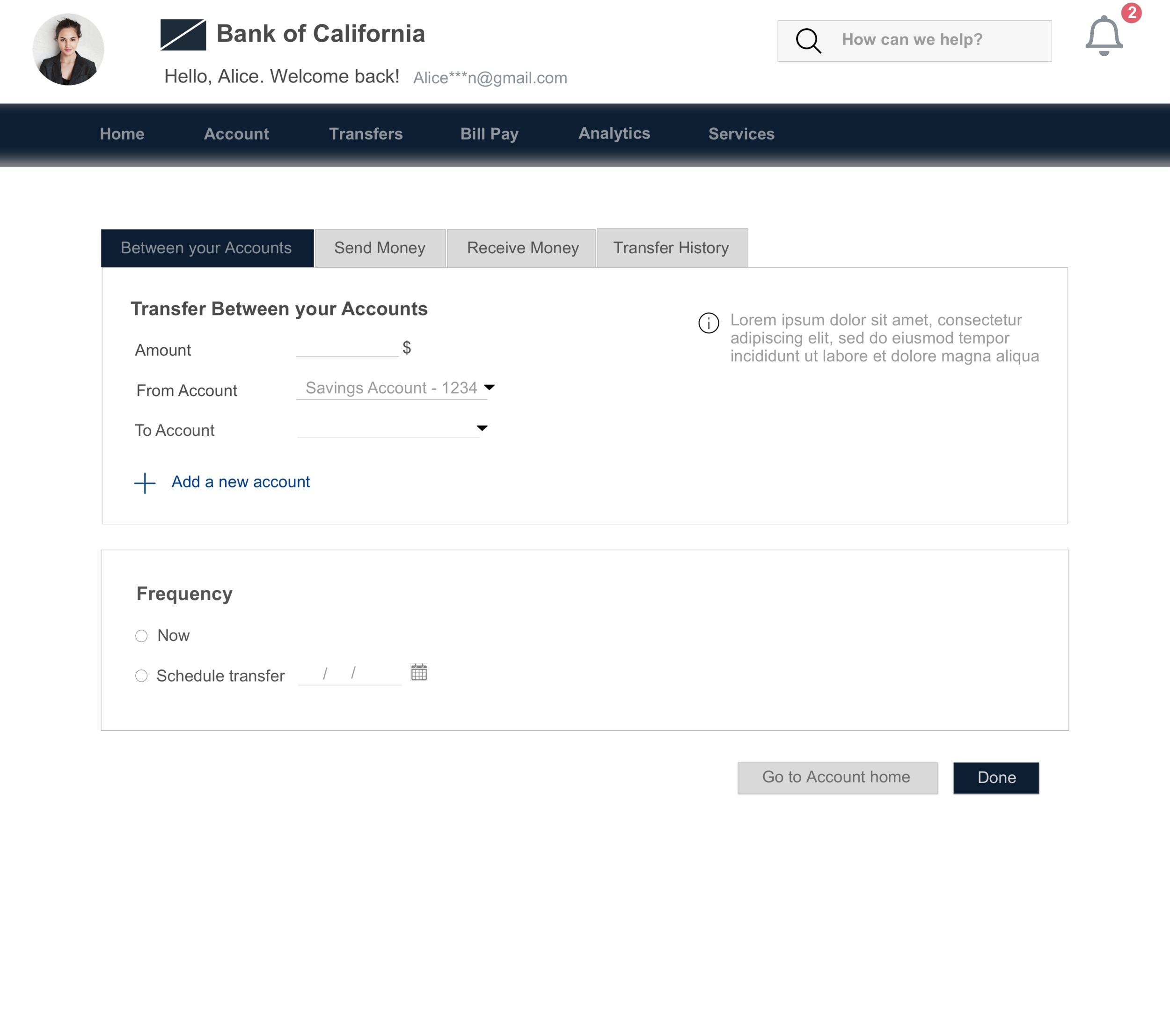
Transfers -
Users can switch between the tabs to perform different types of transfers.
RESULT -
When asked to perform the tasks like scheduling payments, or checking the monthly budget, 6 out of 8 candidates for usability testing were able to perform them correctly, without any confusion for choosing between navigation options.
What would I do differently -
For the purpose of this project, I chose to focus on the discoverability and easy navigation aspect of online banking. But during my research and testing, I found that "Transfers" and "Payments" might still be a grey area for users not very familiar with online banking. If I would do this again, I would spend more time focussing on those areas.